Actual Results: See some ways we increase conversions on our InvestorCarrot system and how our members are getting nearly 40% – 55% conversion rates on their cash buyer websites below…
People talk about “conversions” all of the time with websites, but over at our sister company Carrot… we show you real stats from real tests that we’re running with real Carrot customers. Cool eh?
In this article you’ll see how we’re able to get our cash buyer websites converting (depending on the Carrot member) between 35% – 55% of visitors to cash buyer leads.
Now, yes, cash buyers and tenant buyers are easier leads to get than Motivated Seller leads… so you shouldn’t expect to see these types of conversion rates on your Motivated Seller websites… seller leads are just harder to come by.
But the cool thing is… the same elements that make our Cash Buyer websites convert so well are built right into your Motivated Seller websites as well!
Today I’m going to break down exactly how our Cash Buyer sites work to generate consistently high conversion rates (across our user network) and show you some unexpected strategies that we’ve used in the design.
Then I’ll show you a current test we’re running right now – it’s generating some very cool results and improving conversions even more.
If you’re a Carrot Member, you can start implementing the changes on your sites right away… and if you’re not, go here now and get signed up.
So without further ado…
5 Conversion Boosting Elements To Get Consistently High Conversion Rates

The screen shot above shows the traffic for about 9 weeks to the home page of a certain Cash Buyer site that’s on our system.
The main “lead page” on that same website (the same Lead Page we have built in by default on all of our Cash Buyer websites) is converting even higher… at 47.22% right now. Pretty darn good numbers.
Here’s a screen shot of her home page of the site (I’ve blurred off the info because we’re currently testing it; if you want to see live sites in action check out this post):
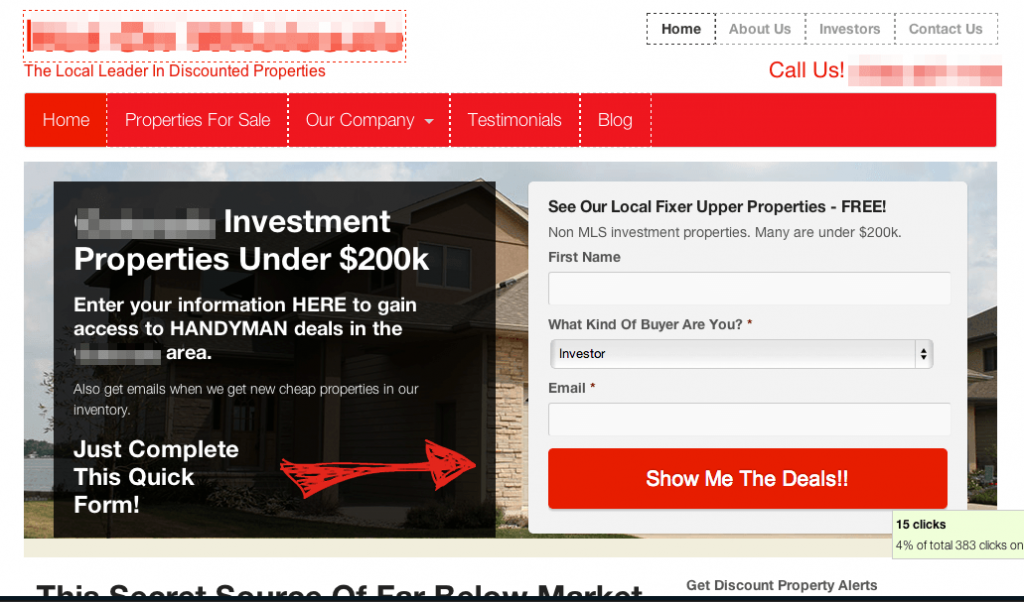
This “Cash Buyer” website hasn’t been customized hardly at all from our default format… it’s 98% the way it was when she launched it in our Carrot system. She got the site up within minutes… made an hour of customizations, and got to work!
4 Key Conversion Boosting Elements On This Website (And all of our InvestorCarrot websites)
Our InvestorCarrot system has about 24 conversion boosting elements built into your websites… we’ll show you 4 of the 24 on this Cash Buyer website that are helping conversions big time.
There are a lot of key features about this page that we’ve honed over the years while getting over 80,000 leads through our systems.
1. The offer is clear and 2. your eye is drawn to it immediately
“Show Me The Deals”… with a big HUGE button on the opt in box (read this post about how the bigger button increased conversions 29%! >>) . Nothing distracts the visitor from that objective, which helps to increase conversions. There is no paradox of choice created here. Also, notice our button doesn’t say “Sign Up” or “Submit”. Give people what they are looking for right there in your opt in button. (this is already built into our InvestorCarrot system).
Also notice the red arrow that points directly to the opt in box to the right… that directs the eye to the form and has shown to increase conversions 15-26% in some tests.
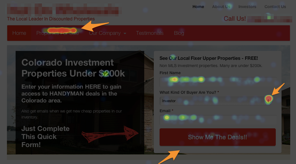
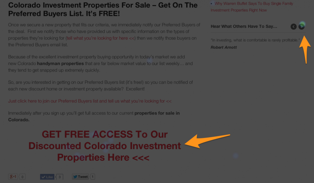
Heat Map Image: This shows the places on the website cash buyers are engaging in the content. Notice the big bold button below the opt in box. That increased conversions 29%. Also notice the VERY CLEAR call to action.
3. There is a nice balance between text and visuals that keeps the eye moving around.
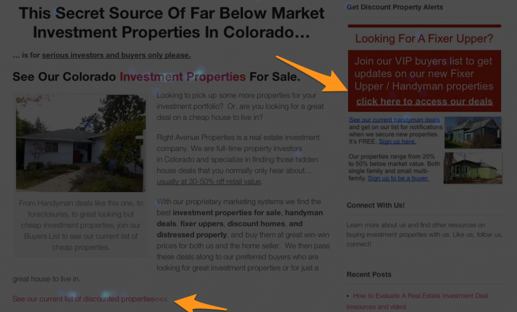
Notice on the Heat Map (a heat map is simply a software that helps us track the places website visitors engage in the page)… that we have great content built into the website + engaging visuals to keep the reader interested. See where the bright spots are below where people are clicking on parts of our content and the banner image in the sidebar that is designed to look like real text? None of this is an accident… it’s all designed to work this way.
When people click these links it takes them to the main lead page that is converting at 47.22% on this particular website. Again, all of this is built into all InvestorCarrot websites already… so if you’re a Carrot member… don’t worry, your cash buyer sites already have all of these elements and the content built right in!
If you’re not an InvestorCarrot member and want to leverage our system, awesome! You can see our plans and pricing here.
COPYRIGHT NOTICE: All of the content on our websites are 100% Copyright protected and owned by our company. Only active paying InvestorCarrot members can use the content on our websites. If we find people copying our content off of our customers websites or from our images on this page, we will pursue violators for copyright infringement.
NOTE: Again, please be creative and write your own content. The content above is owned and written by InvestorCarrot… and only available for use by our active paying members. We actively monitor the internet to find people infringing on our copyright and pursue action. We have to do this to protect our active members and the investment they and we have made. If you’d like to leverage our system, our content, see our pricing and plans and come aboard, we’d love to have ya!
Encourage people to browse if they’re not immediately ready to opt in –
We encourage the visitor to click around. But you say… “everyone tells me that people should just land on a squeeze page. They say links decreases conversions”. It’s true… but NOT ALWAYS. We’ve tested it and driving people to the home page of our websites has consistently had higher conversions than driving people only to a squeeze page with no links. Why? Because we’ve built our InvestorCarrot system so your homepage IS a LEAD PAGE… BUT, the visitors that aren’t ready to convert immediately then also have very engaging and compelling content to browse around. The content we’ve built into the websites is built to convert visitors on EVERY PAGE of the website… so even if they browse around… every page has an option for them to convert.
4. The site looks professional, but not corporate.
The design feels friendly, with access to testimonials and company info are up front – encouraging visitors to check out your credentials helps boost credibility, which increases conversions.
We’ve ran tests and more often than not, websites that are clean and professional… but NOT corporate feeling… tend to convert higher. Some of our highest converting pages in fact are some of the ones that look the least attractive. Why? I guess it makes people feel a better connection with the business behind the website because it’s less “businessey” and more “I’m a real person”.
Make sense? 🙂
Here’s A Bonus Conversion Booster – Localize Your Call To Action
We’ve talked about localizing your website content before on our training webinars… in almost every case it increases conversions.
In fact, we’re currently running this test (it’s still in progress so we’re still collecting data)… but the results so far are pretty cool and we expect the results to remain this way as more visitors land on this particular cash buyer website from a South Florida InvestorCarrot member:
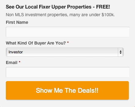
The Control: The Call To Action button says “Show Me The Deals!! converting at 20.93%
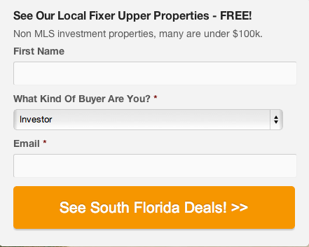
The Variation We Tested: We just localized the Call To Action to “See South Florida Deals!!” converting at 29.41%!
Just “localizing” the button improved conversions by 9%!
Simple eh?
We’re continually testing things like this on our system with our members and when we find something like this that converts better… we build it right into the system OR we email our members to let them know to make the update 🙂
A huge benefit of being an InvestorCarrot member.
How To Boost Your Own Real Estate Cash Buyer Leads And Conversions
We only had time to show 4 of the 24 “conversion boosters” in this Carrot Test Kitchen article that are helping the cash buyer conversion rates reach upwards of 40-55%. On this particular website in Denver their home page converts just under 40% while the main lead page that the home page links to (built into your websites InvestorCarrot members!) is converting at almost 50%.
If you are an InvestorCarrot member, all of the elements in this article are ALREADY BUILT into your websites. You don’t have to do anything. Awesome being a Carrot member eh?
If you are not an InvestorCarrot member, don’t fret… go to your web guy and tell him to…
- Make your opt in button bigger (ideally the width of the actual opt in box fields, like ours is on the examples on this page)
- Make the CTA (Call To Action) very clear and benefit oriented. If yours says “Submit” or “Join”… update it ASAP to explain the benefit your web visitor will get when they opt in
- If you’re only using a squeeze page to build your cash buyer list… you’re missing the boat. Make your home page a lead generation page and build your website content so it’s engaging, builds credibility, and gives people places to opt in on every page
- Build in a “2 Step Opt In” into your websites…
… if you don’t know what a “2 Step Opt In” process is… look out for our next Carrot Test Kitchen article a week from today.
This one thing has boosted conversions on cash buyer websites, seller websites, and tenant websites by as much as 34%… AND, increased the quality of the leads on the backend in a HUGE way.
We’ll walk through this 2 Step Opt In Process in detail w/ examples and actual numbers next week.
Quite the cliff hanger eh? 🙂
What To Do Next
If you’re a Carrot Member interested in being a test subject, please let us know in the comments below with a link to your site… in the next few weeks we’ll be working with folks during our Weekly Live Mastermind Webinar to improve their results, so make sure you click that link to sign up!
If you want our help building your traffic to your site, our SEO service is the first step you must take.
If you want to learn what you can do to get more leads, read this post.
If you’re not already a Carrot Member, watch the demo video here or see our pricing below.
