In other words… Does your website automatically adapt for the screen on the device that your customer is using to look great to the customer so they engage in your website more easily?
(Try our free test to instantly see how your website looks on mobile devices <— Click here)
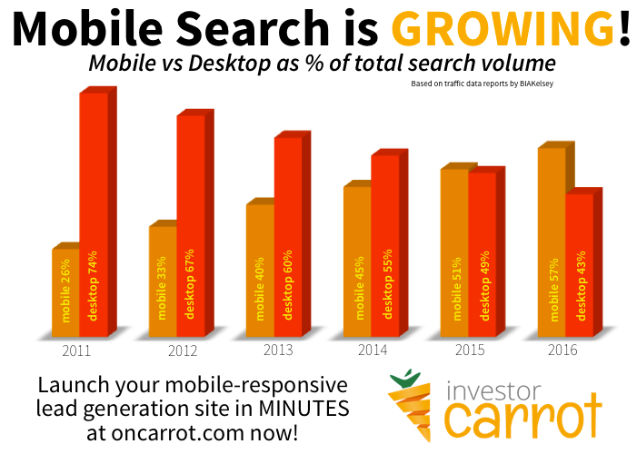
Every year the % of searches online with mobile devices (cell phones, ipads, etc.) is growing… which means more and more of your website visitors are viewing your website on their phone! Is your website setup *correctly* to handle that? See how below…
Even though a huge amount of internet use is taking place on tablets, mobiles and other devices, a frightening amount of real estate investor websites aren’t set up for mobile users.
Smartphone visits account for a huge share of the growth of the internet.
People are using their mobile devices more frequently for local search – and that matters a lot for real estate investors.
Google says that 40% of mobile searches are local in nature, which seems obvious once you think about it. People are using their phones to access information while they’re out and about. That trend is going to continue rising, and fast.
If your real estate website is set up to convert well, it can easily capture leads from someone who is searching while stuck in their car, waiting in line, or killing a few spare minutes before a meeting.
Plus, more and more many people ditch getting a full on computer for their house and just use their cell phone to browse the internet and check their email.
Too many real estate investor websites are losing huge amounts of conversions just by not being ready for them.
So back to the main question…
If you’re not, you should be checking out the InvestorCarrot demo video right now.
But don’t worry… you’re not alone.
I’ll use an example from a really smart and successful investor now – just to show that even great real estate investors aren’t optimized for mobile.
This guy has already been named to Inc’s 500 list and is one of Tennessee’s fastest growing businesses, so he’s doing a lot of things right. He’s working really hard to build an awesome business, and it shows.
((My thanks to Chris Clothier from memphisinvest.com – I just spoke to him about using his site as an example… and he’s right, it would have been more polite for me to ask permission first… I have never been good at asking first, but I’m trying to get better, so here’s my apologies along with my thanks to him for being a good sport.))
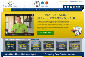
His site isn’t responsive… it doesn’t automatically adjust the layout to make it easier for mobile phone users, which may or may not (depending on their device) be able to play the video on his home page.
His site’s menus will be very difficult to use on a touch screen, and chances are good that he’ll lose any mobile users who may have been interested in his products and services.
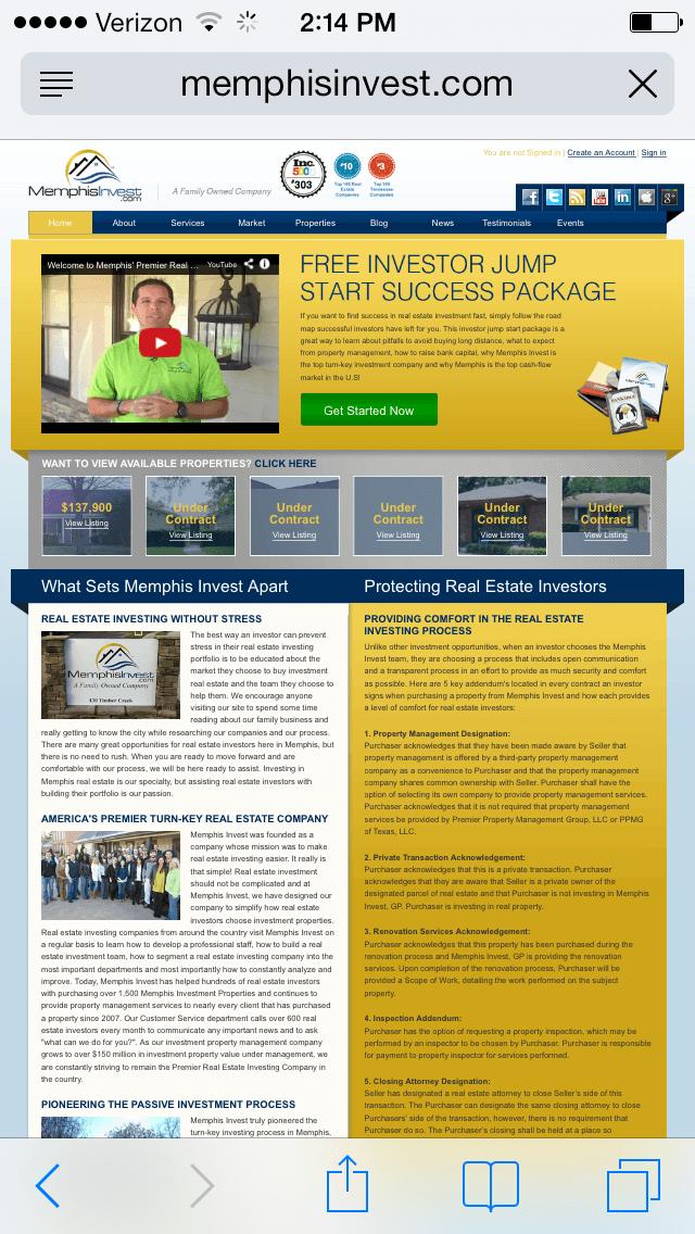
Just to be fair, Chris does have a nice looking website – here’s a desktop photo below.
There’s a few things I’d change to make it covert better, like adding a first-step opt-in form to capture email addresses right on the front page before going to a longer form (that’s a feature we’ve used to get huge conversion rates on our cash buyer sites, but I’ll save that for another post).
Most important takeaway for sites like Chris’s: make an offer on the front page with a short form to capture basic info. If someone only has a few moments to access your site, make it very simple and clear. Chris is primarily targeting investors, so access to investment properties or a free report would probably convert well right on that main site.
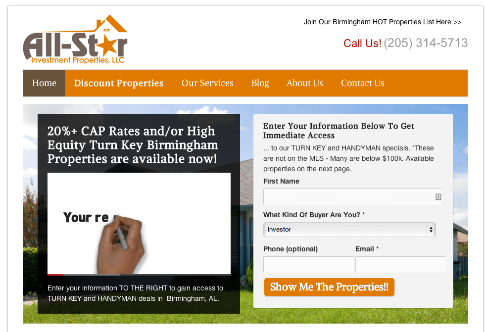
Here’s an example of one of our optimized sites that’s converting really well with a clear call to action:
As you can see, the call to action is clear and they’re taking some basic contact info on the main page… once a buyer opts in, that person will be taken to a second page that collects just a little more information on the buyer… that’s a opportunity to qualify accredited investors who are willing to “raise their hands” during that second step of the process.
Now let’s see how that translates to the mobile screen:
As you can see above, the page has automatically changed its layout… because the site is mobile responsive, like all InvestorCarrot sites. There is a clear call to action at the top that is easily legible and clickable: “Join our Hot Properties List Here”, plus a “navigation” menu and the ability to keep scrolling.
Here’s what the navigation menu looks like when clicked:
As you can see, the choices fill the screen so it’s easy for a mobile user to click the options (instead of having to pull-zoom and click really small links, which usually ends up in a frustrated user… and frustrated users don’t opt-in, they leave.
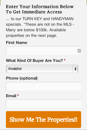
And if a visitor to the site scrolls down past the navigation menu, they’ll get to an easy form to get access to the properties:
As you can see, the Call to Action at the bottom is clear and it fills up the screen, plus the form is short – only 4 choices, easy to fill out on a mobile device. This website will help convert mobile visitors into actual customers and leads… not bounce them away in frustration.
Want to see how your site looks on mobile devices?
Ready to take your business to the next level?
Get a mobile responsive lead generation machine launched in just minutes:
Sign up for InvestorCarrot ? Watch the demo now!


