Real live test results from a motivated seller site. What small but powerful change did we make to this site to boost conversions by almost 30% overnight? See below…
Today we’ll be sharing one change that made a huge difference – just this little fix almost doubled conversions on the site where we tested it.
As you know, InvestorCarrot is totally customizable – so we get lots of variations throughout the system with our customers. We love to test these variations to find out more about what works to convert site visitors into real, genuine leads.
This could be motivated sellers of real estate, cash buyers, private lenders, tenant buyers for rent to own, etc.
Sometimes the littlest changes can make the biggest difference.
In the case of today’s example, that’s certainly the case.
Now, we all know that buttons are really important… but even we were shocked by the results of this change. A 31% improvement in conversions overnight? Wow!
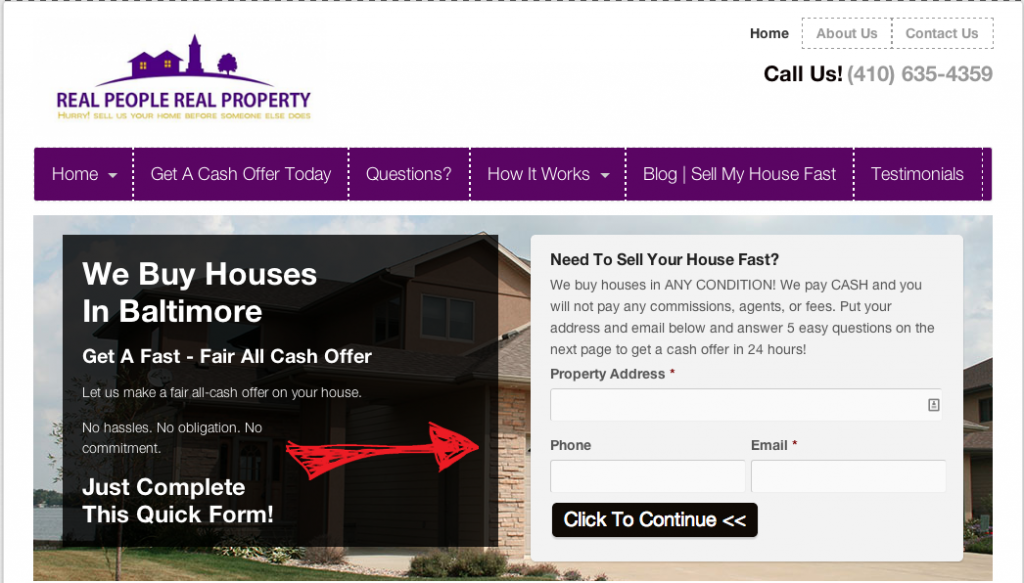
Here’s the original (we call it the “Control” in our tests) front page of this motivated seller site:
During the test period (about 45 days) it converted at 10.53%… which is decent… room for improvement but decent. This means just over 1 out of 10 motivated sellers who landed on the site gave this InvestorCarrot member their info about their house.
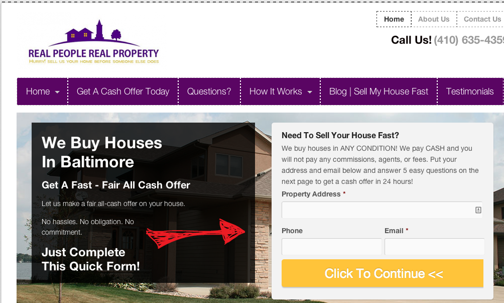
Here’s the variation we tested:
Do you see the difference?
Bigger Action Button + Color Change From
Black To Orange…
We increased the size of the “Click to Continue” button to fill up the form’s window, and we changed the color.
During the test, conversions increased by almost 30% overnight… to 13.64%.
That’s a 29.55% improvement!
Why did this simple button size and color tweak on this motivated real estate seller website increase conversions so much so quickly?
A few reasons to note:
- In almost every test we’ve ran, and we run a lot, the bigger the “call to action” the higher the conversions. This button is about 5 times larger than the previous black button… so it grabs the website visitors attention right off the bat.
- Color Matters A Lot – We can’t say that any particular button color always converts the best on all websites… but we can say that simply testing other button colors can increase results big time. In this case, we tested Orange instead of black and it saw a big bump. Orange is seen as an “action” color… and grabs the attention more than black.
We’ll also try to test out other button colors to see if we can raise conversions even more on our members sites as we go.
Over the next couple weeks we’re going to update our default to increase the size of the button on our InvestorCarrot members websites. This is a another HUGE benefit of being an InvestorCarrot member… we’re continually testing and tweaking designs and approach conversions from the science side of things.
As we find things that work better that are science based… we trickle those improvements down to our members sites FOR FREE.
If you care about higher conversions… Join InvestorCarrot and let us do the testing for you.
We love to see these kinds of results when we run split tests.
They help guide our system-wide improvements so that we can add even better squeeze pages, content and forms to our member’s sites.
We’ll be upgrading your sites within the next couple of weeks to include a lot of awesome improvements and changes like these that help dramatically increase results for our members.
If you’re not yet a member, jump on board to get these same benefits!


